Layout
Layouts are common page composition patterns that offer ways of structuring components and content.
Always design for small screens first.
For most types of pages, use either a ‘two-thirds’ or a ‘two-thirds and one-third’ layout. Doing this reduces long lines of text that can make a page hard to read on desktop devices. This approach should limit lines of text to 75 characters.
You should never assume what devices people are using. This is why you should design for different screen sizes instead of specific devices.
#Page layouts
There are 2 standard page layouts:
- Full width.
- Two column - right side.
#Full width
Displays the main content area the full width of the container.

#Two column
Displays a right hand sidebar that stacks on <991px breakpoints. The main content area is always visible.

#White Space
Use adequate white space in the layout to separate elements and create a sense of hierarchy. This helps to make elements on the page easier to distinguish and understand, and creates visual harmony.
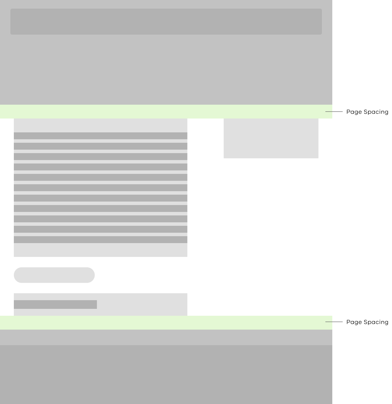
#Page Section Spacing
Spacing is used between the ‘above’, ‘body’ and ‘below’ content sections.
For both XS and S breakpoints, section spacing is added between the body section and sidebar section when in use.
| Breakpoint | Value | CSS Variable |
|---|---|---|
| XS • <576px | 32px | rpl-sp-8 |
| S • 576-767px | 32px | rpl-sp-8 |
| M • 768-991px | 48px | rpl-sp-10 |
| L • 992-1199px | 64px | rpl-sp-12 |
| XL • 1200px+ | 80px | rpl-sp-13 |
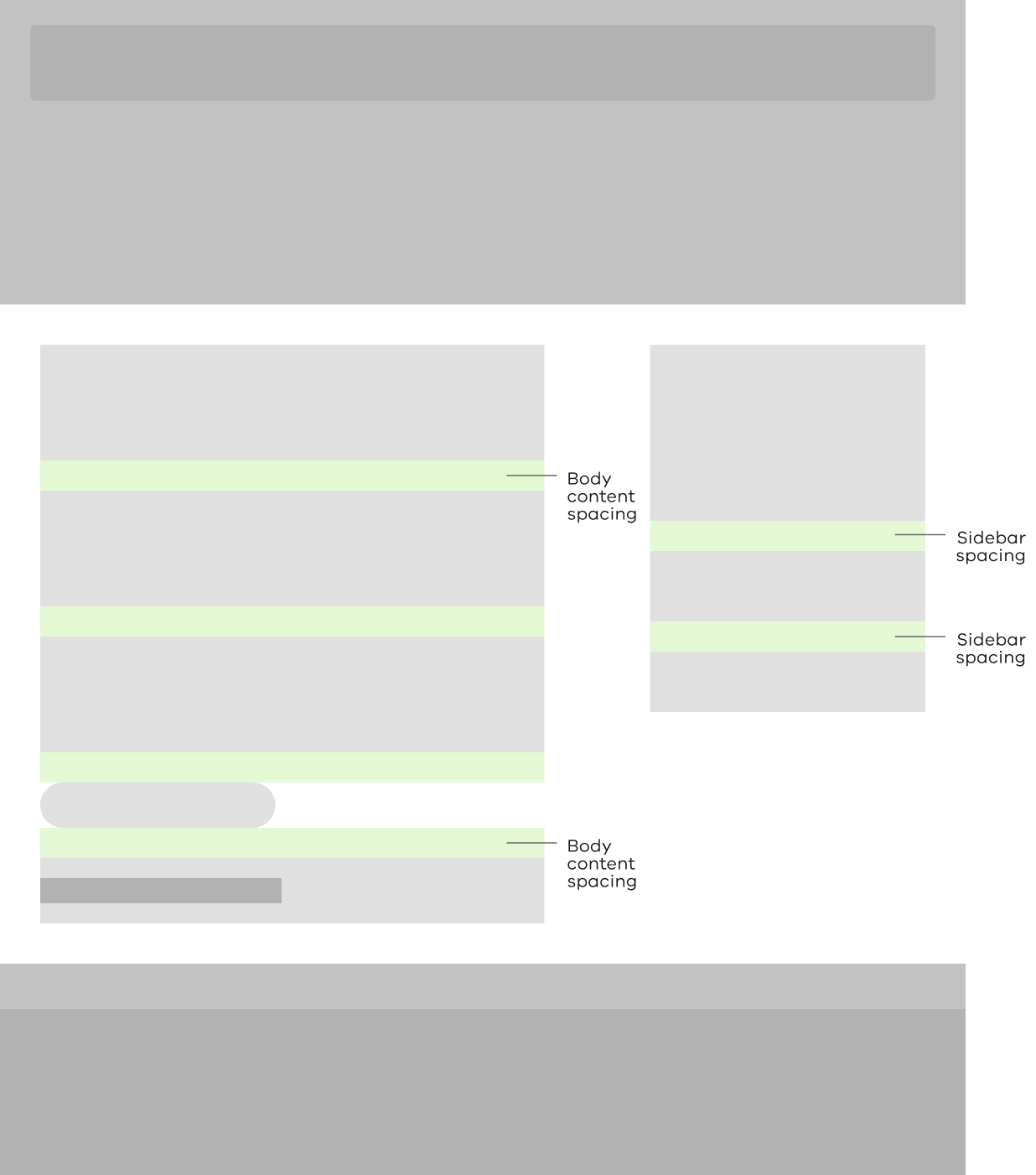
#Content Layout Spacing
We define spacing between components and elements at a breakpoint level. This compliments the grid and applied layout.
| Breakpoint | Value | CSS Variable | Sidebar Value | Sidebar CSS Variable |
|---|---|---|---|---|
| XS • <576px | 16px | rpl-sp-4 | 24px | rpl-sp-6 |
| S • 576-767px | 16px | rpl-sp-4 | 24px | rpl-sp-6 |
| M • 768-991px | 24px | rpl-sp-6 | 24px | rpl-sp-6 |
| L • 992-1199px | 32px | rpl-sp-8 | 32px | rpl-sp-8 |
| XL • 1200px+ | 40px | rpl-sp-9 | 40px | rpl-sp-9 |
Propose a change to this page on GitHub.