Icons
Use icons to illustrate actions and interactions, communicate statuses, and draw attention to important information.
Icons are a visual representation of an action, idea, or object. They provide a quick and easy way to communicate information. They can also enhance the usability of a design.
Use the Ripple Design System's icon set for a consistent user experience and a cohesive look and feel.
You can add icons to components or pair them with text. Icons should have a clear relationship with their corresponding text or action. This keeps them accessible to users with visual impairments or disabilities.
Avoid using icons alone, as one user may interpret them differently to another.
#Icon Library
Alerts
Social
Standard
Accessibility tip
If you're using an icon by itself, ensure it's using the right label for screen readers.
If you're using an icon and text, ensure only the text gets read out.
#Application
#Sizing
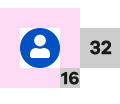
The Ripple Design System displays icons at four sizes (12px, 16px, 24px, 32px) depending on their type, use and screen size.
| Preview | Value | Size |
|---|---|---|
| 12px | xs | |
| 16px | s | |
| 24px | m | |
| 32px | l |
#Spacing
Ensure you use the right amount of space around an icon to allow for legibility. At the least, icons must have clear space of 50% of the height/width of the icon.
#Accessibility
For accessibility, ensure you:
- wrap icons within their interactive component
- specify if an icon is decorative and informative by assigning the property in code
- use descriptive and meaningful titles for informative icons
- use icons to represent the same action or idea.
#Styling
#Colour
If a background changes the colour of the text (for example, a button) the icon should take on the same colour as the text.
Icons used to represent a state should use the correct colour. For example, an icon used in a success notification should use rpl-clr-success.
Propose a change to this page on GitHub.