Header
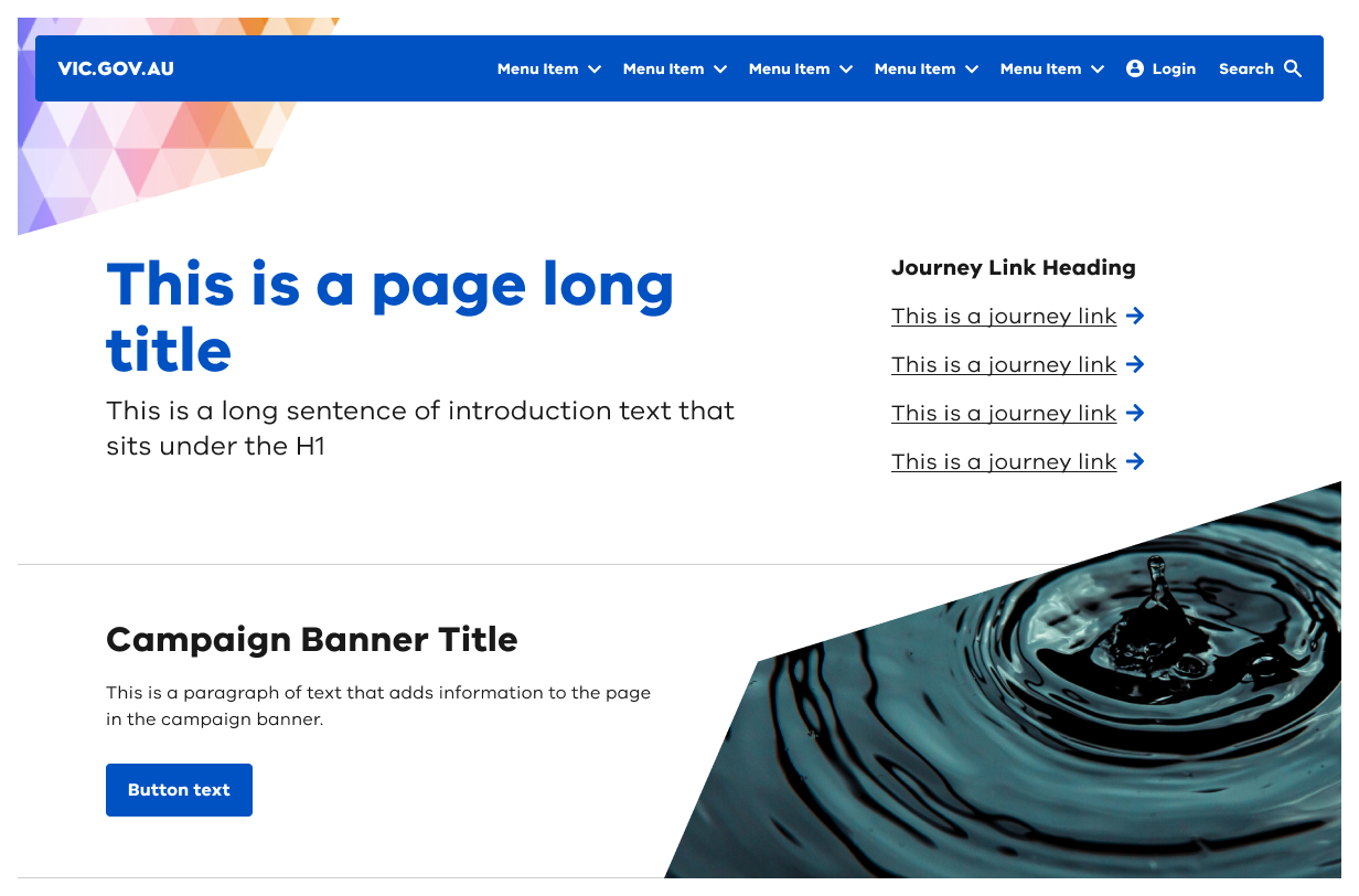
The Header component introduces the purpose and content of a page.
#Usage
Use headers to inform the user of what is on the page. The header must be placed at the top of a page above the main body content and styled as an H1-level heading.
Headers include optional content such as introduction text, journey links, a call to action and an introduction banner.
Headers should feature a primary message and/or call to action. They can be accompanied by supporting content such as images or corner graphics.
The header can also support a campaign logo if required. This will display above the page title.
#When and how to use
- Keep the header simple and concise.
- Use clear calls to action that align with the message or task.
- Only use images that add value to the content and support the message.
- Include with featured links and buttons to help users perform key tasks.
- Include an optional campaign logo.
#When and how not to use
- Don’t use a mix of reverse and default page title and introduction text styling.
- Don’t include the same links in the main and introduction banners.
- Don’t use with more than 6 journey links.
- Don’t overload with content.
#Variants
The header has 3 variants:
- default
- reverse
- image.
The default and reverse variants can be used with journey links or a call to action. These guide users to perform tasks or navigate to related information.
They can display corner images to enhance brand recognition and visual prominence. They can also display a supporting campaign logo if required.
The image variant displays a full background image with reverse blocked text. It only supports a page title and introduction text.
All variants can be used with the introduction banner.
#Default
#Reverse
The reverse variant uses reversed blocked type for the title and introduction text. This adds visual prominence to the banner and its information.
#Image
An image can be added as a full background image. The title and introduction copy will always display as the reversed blocked type.
Images should not be stretched or too low in resolution. They should also not be complex or include text.
#Introduction banner
The introduction banner:
- can be used to add content and journey links under the page title and introduction section in the main header banner
- has an optional icon and journey links
- should contain content relating to the content in the main header.
#Interaction with other components
When using a featured campaign banner with an image, the image can overlap the header, depending on the amount of content. By default, this will hide the header's bottom corner shape.
The bottom corner shape won't hide if an introduction banner is between the header and campaign banner.
#Theming
Headers can be themed in 2 ways:
- site colour palette
- neutral colour palette.
It will also adopt theming from the button component when displaying the call to action.
If you choose neutral button for your site, the header will display buttons in the neutral theme.
#Neutral theme
Implemented at a site level, headers can have a neutral theme option. This option is only applicable to the reverse blocked type. Neutral headers have predefined neutral colour values that must be used and cannot be edited or customised.
To create your own theme see theming guidance for designers or theming guidance for developers.
Propose a change to this page on GitHub.