Focus state
Focus states show when a user has highlighted an element, using an input method such as a keyboard or voice.
Some users use keyboards or other devices to navigate through a page by jumping from one interactive element to the next. Focus states help users understand which element is currently selected and ready for interaction.
Focus states are orange and neutral-800, aiming to conform to the WCAG 2.1 Level AA non-text contrast on any background colour.
We have chosen this orange colour as it is a direct opposite of our primary colour. This allows all colourblind users to see a visual difference. Focus state styling also removes any border radius to create a bigger visual difference to surrounding elements.
#Inline style
The inline focus state helps links stand out from the rest of the content on a page. When a link receives focus, it will underline and change background colour. Other components and elements that look like links use the inline style.

.rpl-u-focusable-inline
#Block style
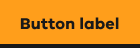
The block style completely highlights a section or whole component with the focus state. For example, when a button receives focus, a border is added to the bottom of the container and the background colour will change.
.rpl-u-focusable-block
#Outline focus state style
The outline styles are for when form inputs are focused. When a form field receives focus, it adds a border. If the element already has a border, the border gets thicker.
.rpl-u-focusable-outline
#Modified focus states for components
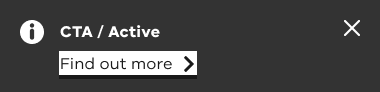
The alert component has a modified focus state colour. This is consistent across all alert variants. It meets colour contrast requirements on all semantic colours, including danger and warning.
The modified styling uses a white background in place of the orange, still with the dark content and border.
#CSS Variables
The focus state has three CSS Variables.
| Swatch | Element | Value | CSS Variable |
|---|---|---|---|
| Background Fill | #FF9E1B | rpl-clr-focus | |
| Content / Text / Icons | #1A1A1A | rpl-clr-focus-contrast | |
| Bottom Border | #1A1A1A | rpl-clr-dark |
#Theming
For advice on focus state theming, see theming guidance for designers or theming guidance for developers.
Propose a change to this page on GitHub.