Grid
With up to 12 columns, you can build grids with responsive layouts across different breakpoints.
Grids are a crucial component of any design system. They provide a framework for arranging content in an appealing and structured manner.
We've designed the grid for a high degree of flexibility and responsiveness.
#Breakpoints
Ripple has 5 breakpoints. These ensure content is at an optimal layout for readability and accessibility.
| Breakpoint | Width | Active content area |
|---|---|---|
| XS | <575px | 288 – 543px |
| S | 576 – 767px | 544 – 735px |
| M | 768 – 991px | 736 – 927px |
| L | 992 – 1199px | 864 – 1071px |
| XL | 1200px + | 1040px |
#Grids
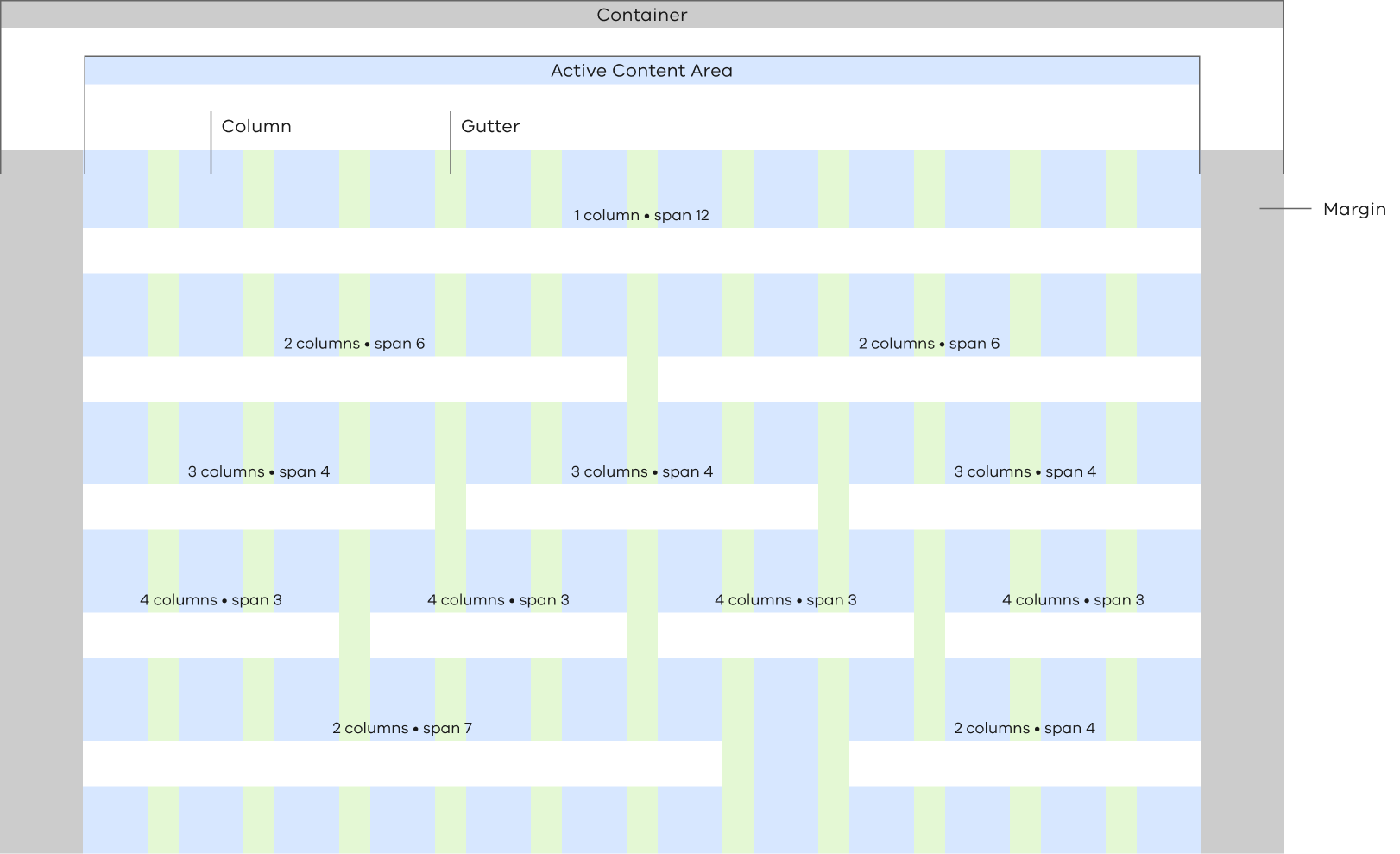
The grid is made up of three elements: columns, gutters, and margins.
| Breakpoint | Margins | Gutter | Column type / width |
|---|---|---|---|
| XS • <575px | 16px | 16px | Fluid |
| S • 576 – 767px | 16px | 16px | Fluid |
| M • 768 – 991px | 32px | 24px | Fluid |
| L • 992 – 1199px | 64px | 24px | Fluid |
| XL • 1200px + | 80px | 28px | Fixed / 61px |
#Usage
Use the grid system to structure your content.
Most vic.gov.au pages follow a ‘two-thirds and one-third’ layout. But, the grid system allows for more combinations if needed.
Your main content should always be in a two-thirds column. This is even if you’re not using a corresponding one-third column for secondary content.
#Column layouts
| Column Span | Layout | Breakpoint |
|---|---|---|
| 12 | Full | XS • S • M • L • XL |
| 6 | Half | XS • S • M • L • XL |
| 7 | Two thirds | M • L • XL |
| 4 | One third | M • L • XL |
| 3 | One quarter | L • XL |
Propose a change to this page on GitHub.