Usage
Ripple components can be used in several different ways depending on your project needs.
Using Ripple UI components
Whilst Ripple is built to implement sites using a framework built on Vue JS and Nuxt, its modular architecture allows adopting different parts depending on your requirements.
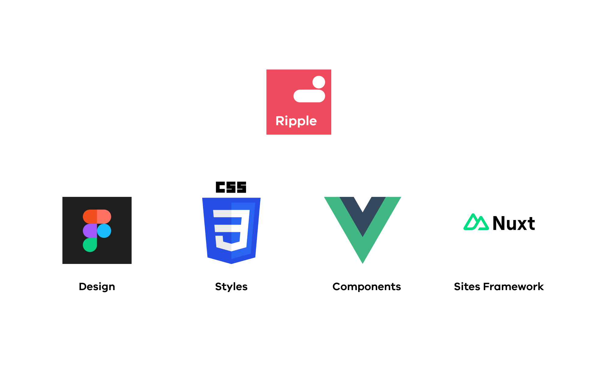
Ripple UI libraries are usable in the following contexts:
Library | CSS styles | Vue Components | Ripple Framework (Nuxt) | Web components |
---|---|---|---|---|
Ripple UI Core | Partial support | |||
Ripple UI Forms |
Using in an SDP website
If you are using Ripple 2 to build a site on the SDP platform, the UI libraries will be included automatically when scaffolding your project.
For documentation on using Ripple with Nuxt in SDP sites, visit the Ripple Framework documentation
Using in a Vue app
To install Ripple UI in your project, run:
npm install @dpc-sdp/ripple-ui-core --save
In order for the styles to appear correctly, you will need to import them. Do this at the root of your project (usually in your app.vue or index.js file):
import '@dpc-sdp/ripple-ui-core/style';
import '@dpc-sdp/ripple-ui-core/style/components';
To use a component, import it from @dpc-sdp/ripple-ui-core/vue
, note the addition of /vue
.
<script setup>
import { RplButton } from '@dpc-sdp/ripple-ui-core/vue';
</script>
<template>
<RplButton variant="outlined" />
</template>
Using in a Nuxt app
To install Ripple UI in your project, run:
npm install @dpc-sdp/ripple-ui-core --save
Ripple UI exports a nuxt module that you can add to your nuxt config, note the addition of /nuxt
:
export default defineNuxtConfig({
modules: [
'@dpc-sdp/ripple-ui-core/nuxt'
]
})
In order for the styles to appear correctly, you will need to import them. Do this at the root of your project (usually in your app.vue file):
import '@dpc-sdp/ripple-ui-core/style';
import '@dpc-sdp/ripple-ui-core/style/components';
There is no need to import the components as they will be registered globally by the nuxt module
<template>
<RplButton variant="outlined" />
</template>
Webcomponents
Web components are a set of web platform APIs that allow you to create new custom, reusable, encapsulated HTML tags to use in web pages and web apps. Custom components and widgets build on the Web Component standards, will work across modern browsers, and can be used with any JavaScript library or framework that works with HTML.
Web components are based on existing web standards. Features to support web components are currently being added to the HTML and DOM specs, letting web developers easily extend HTML with new elements with encapsulated styling and custom behavior. https://www.webcomponents.org/
Ripple exports a limited set of components as standard browser native webcomponents. The advantage of using Webcomponents is they can be dropped straight into traditional webpages and CMS's that do not have javascript build pipeline such as Squiz Matrix and Salesforce.
Support for this output target is currently experimental, if you think you have a use case for using Webcomponents in your project please add a comment here.
Using Ripple CSS styles only
Ripple UI core exports it's CSS stylesheets directly. If you have a use case where you can't use any of the other outputs, you can use our styles directly and provide your own markup based upon the rendered examples in Storybook.
To import CSS styles only you can import them from the ripple-ui-core package.
import '@dpc-sdp/ripple-ui-core/style';
import '@dpc-sdp/ripple-ui-core/style/components';
We recommend that you lock the version of @dpc-sdp/ripple-ui-core
so that any future changes of styles without changes to markup do not break your application.